
July 18, 2024
Behind the Label: The Story and Design of Testamatta Bottles
Testamatta, meaning "crazy head" in Italian, is more than just a name; it is a reflection of the passion and creativity of its creator, Bibi Graetz. Based in the heart of Tuscany, Graetz is known for his innovative approach to winemaking and his dedication to crafting unique, high-quality wines. One of the most striking aspects of Testamatta is its distinctive bottle design, which tells a story as rich and complex as the wine itself.
The Visionary Behind Testamatta
Bibi Graetz, an artist turned winemaker, founded Testamatta in 2000. His journey into winemaking began somewhat unconventionally. With a background in fine arts, Graetz brought a unique perspective to the world of wine. He was not bound by tradition but rather inspired by the possibilities of what could be created. His vision was to produce wines that not only captured the essence of the Tuscan terroir but also reflected his artistic sensibilities.
Graetz's approach to winemaking is deeply personal and hands-on. He works with old vineyards, some over 80 years old, and uses traditional methods combined with modern techniques to ensure the highest quality. The result is wines that are expressive, vibrant, and full of character.
The Artistic Label Design
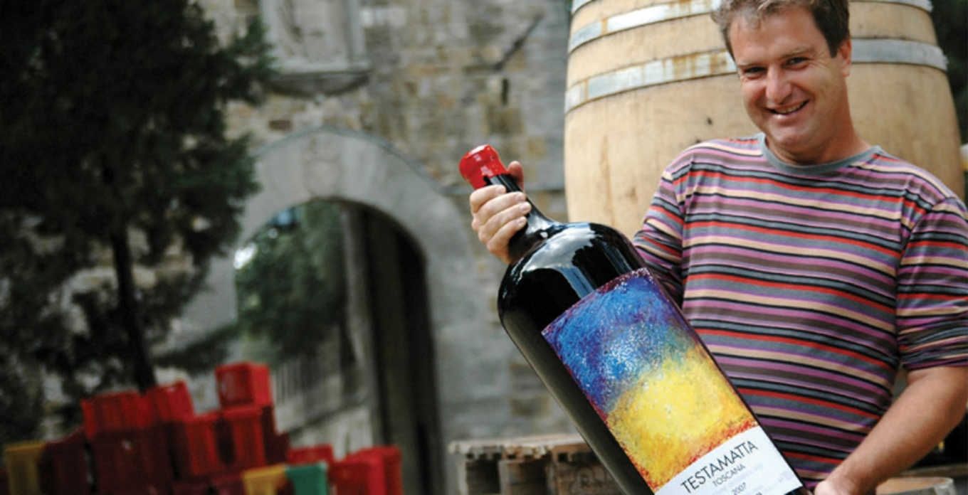
The design of Testamatta bottles is a testament to Graetz's artistic background. Each label is a piece of art, created by Graetz himself. The labels feature bold, abstract paintings that are both eye-catching and thought-provoking. The use of bright colours and dynamic shapes reflects the energy and passion that goes into each bottle of Testamatta.
Graetz's decision to create his own labels stems from his belief that wine, like art, is a form of expression. The labels are not just decorative but also a representation of the wine's identity. Each vintage has its own unique label, making every bottle a collectable piece of art. This approach has set Testamatta apart in the crowded wine market, drawing the attention of wine lovers and art enthusiasts alike.
The Symbolism Behind the Labels
The abstract designs on Testamatta labels are more than just aesthetic choices; they are imbued with symbolism and meaning. The vibrant colors represent the diverse flavors and aromas found in the wine, while the abstract forms convey the complexity and depth of the wine's character. Graetz's use of bold brushstrokes reflects his dynamic and unconventional approach to winemaking.
The labels also serve as a narrative, telling the story of each vintage. The variations in colour and design from year to year symbolize the unique conditions and characteristics of each harvest. This artistic representation adds an extra layer of intrigue and appreciation for those who enjoy Testamatta wines.
Testamatta: A Blend of Art and Winemaking
Testamatta is a perfect example of how art and winemaking can intersect to create something truly special. Graetz's artistic background and innovative spirit are evident in every aspect of Testamatta, from the vineyard to the bottle. His commitment to quality and creativity has made Testamatta a standout in the world of fine wine.
Critical Acclaim and Reception
The wines of Testamatta have garnered significant acclaim from wine critics and enthusiasts worldwide. The 2018 vintage, for example, received glowing reviews for its clarity of flavor and sense of energy. Jane Anson of Decanter noted the wine's "balance and finesse," highlighting the seamless integration of flavours such as raspberry, red cherry, rose petals, and tobacco.
This consistent quality and the artistic presentation have helped Testamatta build a loyal following and a reputation as one of Tuscany's premier wine producers. The unique combination of Graetz's artistic vision and winemaking expertise continues to push the boundaries of what is possible in the world of wine.